Search Quirksmode
Search Quirksmode

“There is where it all began… There is where I understood how far I could go”, Pablo Picasso said of his modern art awakening in Barcelona. So, where better to attend Smashing Magazine’s web design conference than this beautiful and inspirational city.
The Conference itself was held in the exceptionally striking Palau de la Música Catalana, a place where you could lose days just staring at the ceiling, never mind congregating to soak in the words of the world’s leading speakers in design and development. And disappoint they did not. The conference provided me with a lot of key takeaways, which I’m going to share whilst discussing my favorite talks in more detail. To find out what I learned, please read on.

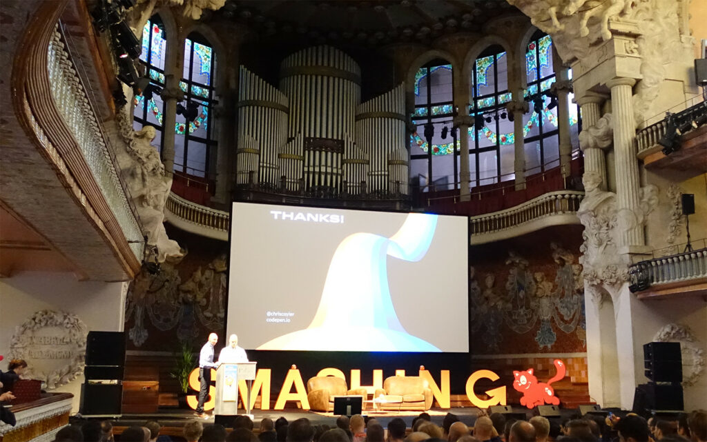
To kick things off, we had a talk from one of my (is it wrong to admit this?) personal heroes of the web. I have followed Chris for many years so it was a real honor to be there in person during one of his talks. The theme of the talk was SVG (scalable vector graphics) and he did a great job of talking about the history, why we should now use SVG and how we can use them today.
Scalable Vector Graphics (SVG) is an XML-based vector image format for two-dimensional graphics with support for interactivity and animation.
The SVG specification is an open standard developed by the World Wide Web Consortium (W3C) since 1999. SVG images and their behaviors are defined in XML text files. In much simpler terms, an SVG is a type of image which can be used on the web and if chosen wisely can provide much smaller file sizes than traditional Jpeg or other compressed image formats. It reduces the need to provide multiple image sizes as it scales dynamically, growing and shrinking automatically, adapting to its environment.
SVG is now the recommended solution for icons on the web, replacing icon fonts as the de facto standard. Browser support is now excellent and even for older browsers like IE8, there are techniques you can use. A build tool like Grunt or Gulp was recommended to automate SVG generation. For example, you can combine multiple SVG’s into one sprite sheet, which will save on file size and the number of requests the browser needs to make.
I found this talk to be exceptionally reaffirming, as all of the techniques Chris outlined were techniques we already use at Beyond, so it was great to see that we are keeping ahead of the curve for this particular format. For more information on SVG and the various implementation techniques, please follow these links:

Product design and development can cover a range of devices and platforms: iPhone, iPad, Android phones and tablets, responsive web applications and websites, desktop apps, and web-based prototypes… and if you work in a very large organization, you may have a range of products and features to add several variations or themes within each of these areas.
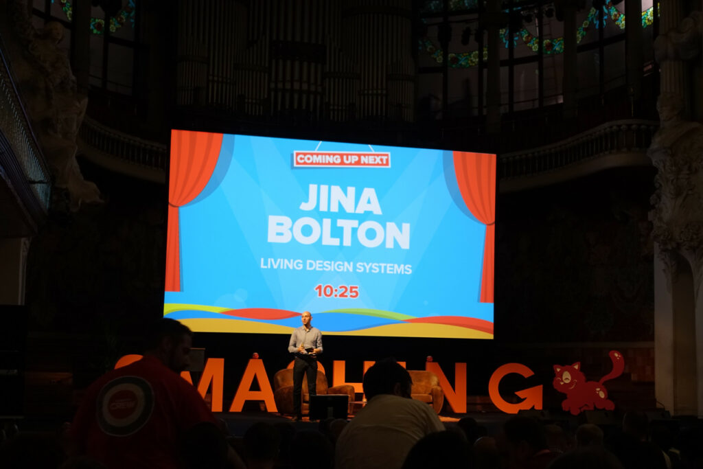
This was the preamble to Jina Bolton’s talk and it proved to be a really interesting look at why systemic design and development is imperative to stay productive and effective across teams, platforms, and devices.
Bring designers, engineers & product managers together around a single goal.
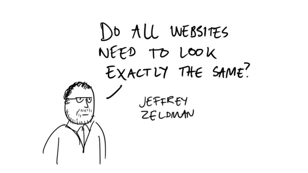
She strongly recommended not using red line design specifications, calling them a fractured process, and instead suggested we use systems. These systems include style guides, living style guides, online style guides, frameworks, CSS pre-processors, and automation tools for living style guides and UI libraries. Creating these systems is only the start of the process and effort must be made to keep them maintained or they lose all purpose and meaning. Her team strives to maintain a ‘single source of truth’ for a truly living spec. through a living style guide and prototype — all of which can improve your product design and development lifecycle. To quote Jeffrey Zeldman:
Design considerations beat design patterns. Test and decide, don’t just copy things like the hamburger icon
In order of importance, her design principles are Clarity, Efficiency, Consistency and Beauty, you can discover more about all of this from the following links

Performance is user experience.
This quote from Patrick really stuck with me; it’s so simple when spoken yet it resonates so deeply within everything we do when developing for the web. The average time a user is prepared to spend waiting for a site to download decreases every year and with so many similar websites competing for the same space it doesn’t matter how fancy your header graphics are, if your site doesn’t load quickly then people will look elsewhere, and very rarely will they come back. The importance of optimization is something that is often overlooked until very late into a project’s life cycle and yet it is something that should begin right at the very start – it’s something that all teams should be aware of and involved in. Some of his suggestions for improving performance were:
He goes on to talk about how one of the challenges facing Front End Web Development today is dealing with single points of failure (SPOF), these could include:
Even the simplest website could make multiple calls to external sources and if any one of these sources fails it has the potential to bring down the entire website or application. An example of this happening was on November 12th, 2014 when Google’s DoubleClick ad server took down ads for more than 55,185 websites for 5 hours. For a lot of these websites, this meant much more than just the ads disappearing, it actually led to entire sites going down as there were no fallbacks in place and with the ad server request being an SPOF, many sites would not render without it. To quote Sam Newman
Baking in the assumption that everything can and will fail leads you to think differently about how you solve problems.
Patrick shared some suggestions for how we can solve SPOF, the most interesting of which were Service Workers, and whilst browser support is still not 100% (Chrome, Opera, and Firefox nightly), they have a bright future and came highly recommended. A Service Worker provides an extra layer between the client and the server and can be used to deliver an offline experience e.g Cached version of your site, offline pages etc.)
He ended the talk by looking to the future and recommending we focus on offline experiences, ensuring that we always show the user something. For further reading follow the links below:

Seb Lester is a designer and artist based in the UK. He has developed logos and type illustrations for some of the world’s biggest companies, publications and events, including the likes of NASA, Apple, The New York Times and The 2010 Vancouver Winter Olympics. This talk was about his life in letters from student days to working for some of the biggest companies in the world to current art and design projects. Looking at my notes, all I wrote for this talk was “unbelievable tekkers” and that says it all really. This guy is superhuman, an unbelievable talent who proves that if you have a raw skill and enough desire to practice it every day, you really can take it as far as you want to go. I will let the videos and images do the talking.

Joe took a look at how to confidently plan, advocate and explain ideas and design, with the aim of getting buy-in from the project team or client and ensure that user experience is the best it can be. Coming from a UX perspective, Joe had some strong opinions on design and was really against some of 2015’s trends (or bad habits depending on who you talk to) including carousels and parallax. Overall he provided a balanced view and it was a really interesting talk, here are some of the points that Joe made:
For more information:

Zoe’s talk was on Flexbox and how it can be used to enhance responsive web development. In her own words “Flexbox gives you more control over the things you care about in a responsive layout—like order, alignment, and proportional sizes of your boxes—and lets the browser figure out the rest—the math-y stuff that computers are good at, like the exact dimensions that are needed on the boxes to perfectly fill the available space. You can create much more complex and reliable layouts with flexbox than you can with floats, table display, or inline-block, all with far less CSS.”
This talk proved to be really interesting and there was a lot of useful information to take from it. I won’t go into too much detail here as it was a very technical talk, so will instead provide links which you can follow to learn more.

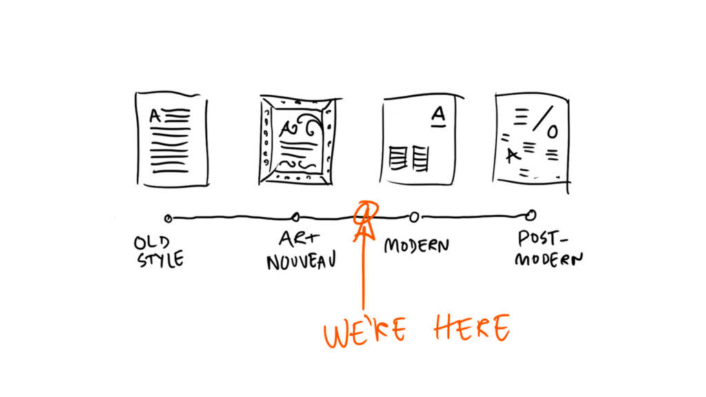
Is the internet, for all its technology, best-practice guides, metrics and measurements making us better designers? Or is it killing creativity, homogenizing ideas and undermining the notion of original thought? This was the preamble to what quickly became one of my favourite talks of the whole conference. What made this such an exceptional talk was the balance it gave to the talk Joe Leech had given previously; it was Design vs UX and the arguments raised were of real interest.
He feels that there is too much focus on creating the perfect, efficient web, that all websites look the same and he doesn’t understand why, are we scared to change? He highlights how if we want to add a carousel or some parallax, that’s fine – if something works for you then do it, don’t be held back by trends and opinions, “fuck the rules (responsibly)”. To quote Matt Hill
I think one of the biggest problems in modern web design is that everyone keeps reinventing things that don’t need reinventing
Espen goes on to explain how we currently use metrics to validate everything we do, but that this is not always actually that useful. For example, when using a burger icon to indicate a menu. As we tweak the icon slightly by adding the word ‘Menu’ we improve the metrics. By making the icon larger, we improve the metrics further. By removing the burger completely and just leaving the word menu we improve the metrics even more. But now we are just left with a large word that says “Menu” and whilst the metrics are positive, the design has suffered as a result, there has to be a compromise somewhere or all websites end up looking the same.

@font-face is an established staple in the diet of more than half of the web. 54% of the top 1000 websites use web fonts and the page weight of these fonts is only growing.
If a page hasn’t loaded in 3 seconds, up to 40% of the users will abandon the site…
In his talk, Zach discussed why current implementations of @font-face are actually harmful to the performance and usability of the web. Hiding the fallback text while the font is loading means the content is unreadable until the font loads. Some browsers have implemented a three-second timeout on font requests but performance surveys have found that many users abandon a site if it’s not usable in three seconds. Mixing high latency cellular networks and use of multiple fonts can mean disjointed repaints and reflows, which can cause serious damage to the fidelity of your content.
People will visit a Web site less often if it is slower than a close competitor by more than 250 milliseconds.
Some of his suggestions for overcoming these pitfalls included:

While this talk didn’t focus specifically on the web, it is still worth mentioning as it was highly entertaining. Andrew Tider is an artist, entrepreneur, and comedian, Jeff Greenspan is the former Chief Creative Officer of BuzzFeed, together they work as a freelance creative team, the two help brands create the most engaging ways to communicate with the world. They also work together on art projects that attempt to start a meaningful discourse. These include cementing a 4-foot statue of Edward Snowden onto a Revolutionary War memorial in a Brooklyn park and becoming “freelance surveillance agents on behalf of the NSA” as part of WeAreAlwaysListening.com. Check out the videos below.

Sadly, the two days flew by so quickly, but it was great to get some time between talks to head out and explore this incredible city; the various food markets and restaurants I visited definitely did not disappoint. A special mention must go to Smashing Magazine, for not just putting on a great conference, but also putting on a great party on Saturday night at the Estrella brewery. It was great to see so many people in attendance. Huge thanks to Beyond for letting me attend, I came back feeling refreshed and inspired – time to start planning the next one…